
OPTUNE: IMPLEMENTING A BRAND ARCHITECTURE
Developed branding and identity system for new oncology therapy. The logo and brand guide were distributed to all vendor partners to execute the brand launch.
The logo had to appeal to physicians on a scientific level and yet be approachable to patients. It had to portray both efficacy and hopefulness. This logo mark represents two pairs of transducer arrays. It’s an active symbol portraying energy pointing toward the solid tumor inside the body. Optimistic, innovative, bold, simple.
Optune noninvasively exerts an antimitotic effect via delivery of frequency-tuned electric fields that act specifically on recurrent glioblastoma multiforme (GBM) solid tumor cells in the brain.
(Work completed at Renavatio Healthcare Communications)
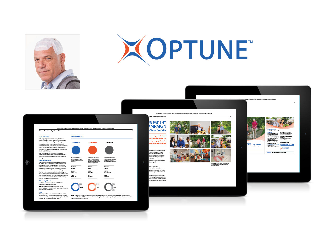
(Above) the logo and brand guide
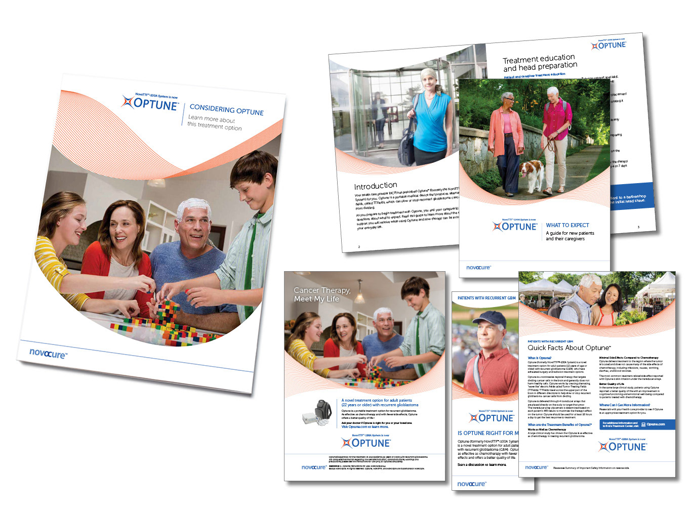
(Above) select patient pieces using the new branding

(Above) some of the logos generated during the design process